Industry 01 / 06
Financial
Create reliable digital platforms for financial businesses such as banking, funds, money transfers, investments, and other financial activities.
Learn more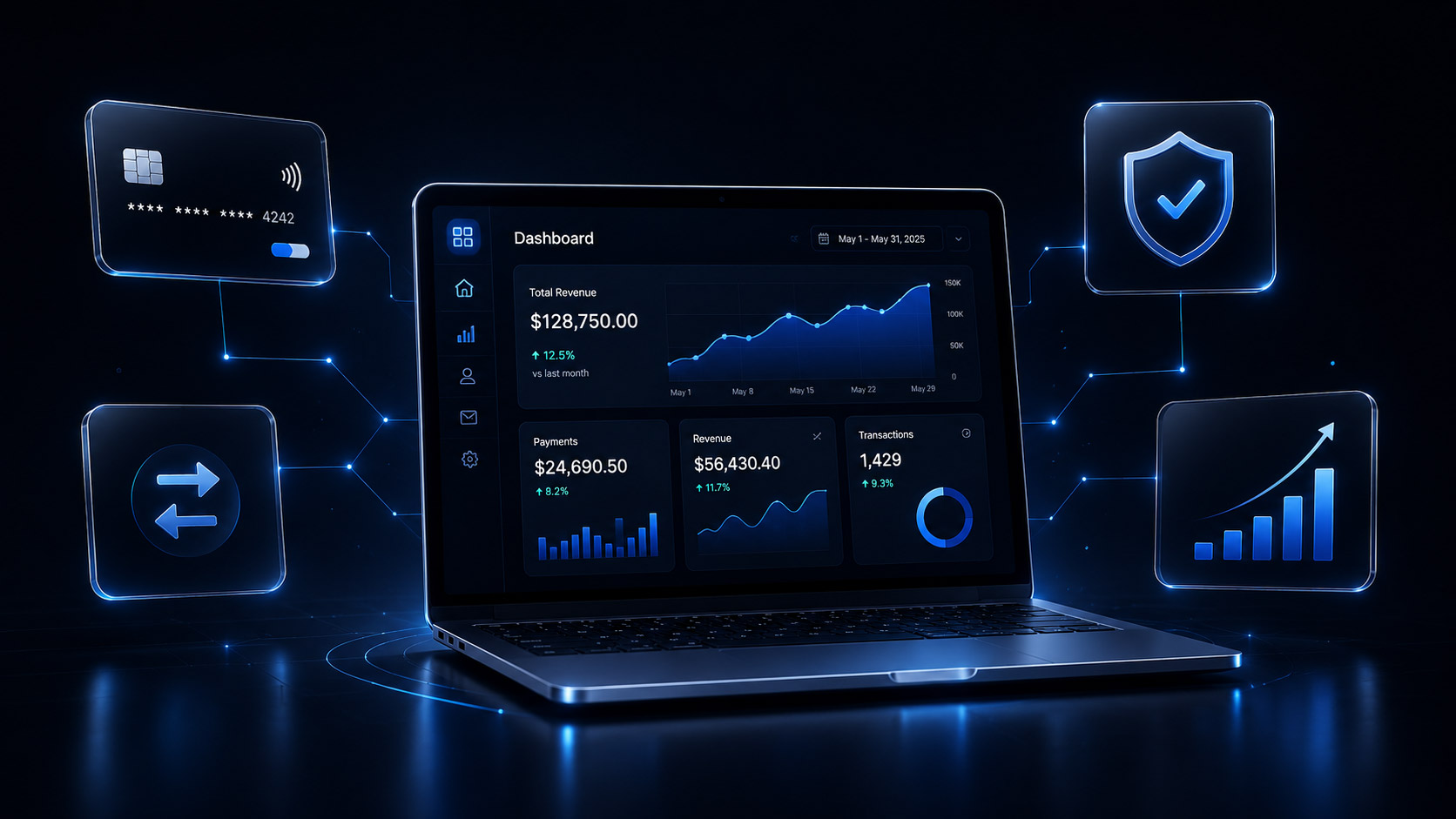

We build mobile-first solutions in digital aspects with the focus on usability, speed, and accessibility in mobile devices. Our mobile-first design solutions allow the business to develop responsive decent websites adjustable to all displays and providing comfortable navigation for every device and simplicity in experience.
Let's Talk to Our ExpertWe innovate around the unique requirements of the mobile user experience. From easy navigation to adaptable layouts to fully optimized performance, our mobile-first web design solutions raise usability, engagement, and accessibility to new heights across smart gadgets, tablets, laptops, and desktops.
When we create websites, we concentrate on core content, comprehensible layouts, and straightforward navigation adapted for smaller screens. This helps users locate information easily and allows for constant service across larger devices.
Our responsive layouts automatically adapt to different screen sizes, resolutions, and orientations. We focus on readable content, flexible layouts, and well-organized elements to deliver a consistent experience across devices.
Using our designs, your mobile users will have the simplest interface for efficient interaction with the flexibility and hierarchy of design. We put touch controls and a clear hierarchy in our mobile design so your users won’t have to work as hard to navigate through your site.
We simplify the menus, navigation bars, buttons, and other interactive elements on smaller devices for easier browsing. Because of our design, your users will be able to easily get to and interact with your important pages and elements.
We design web experiences that offer app-like convenience, including installability and offline functionality where supported. Explore our Progressive Web App Development services to create accessible digital experiences that work across supported devices and platforms.
We focus on mobile performance through efficient layouts, optimized assets, and reduced interface complexity. Faster-loading pages can improve usability and help visitors interact with your website more comfortably.
We design with readability, contrast, keyboard access, and touch-friendly interactions in mind. These considerations help make digital experiences more usable for people with different needs and abilities.
We assist to create layouts, content, and actions in a way that will be the same on every popular internet browser or device. Thus, we pay attention to screen size and usability in our projects.
Businesses that need dedicated mobile applications alongside their websites can explore our Mobile App Development Services for Android, iOS, and cross-platform solutions. We help align the user experience across web and mobile touchpoints.
We focus on achieving client success through high-quality solutions and transparent communication.
Worked with clients worldwide from startups to enterprise companies.
Projects shipped across web, mobile, cloud, and AI.
Build Better Mobile Experiences with Netleon
Netleon employs client-centered design combined with effective development practices and concerns about performance to create usable digital services. With our mobile-focused design services, we support customers with improving usability, growing engagement, and offering seamless user experience across devices.
We prioritize the needs and behavior of mobile users when planning layouts, content hierarchy, and interactions. This helps create digital experiences that are intuitive and easy to navigate.
Our designers and developers work together to align visual design, usability, and technical requirements. This collaboration helps ensure that mobile layouts remain practical and consistent during implementation.
Our layouts are adaptable to any screen size and business requirements. Using our approach the content may be presented in the same manner on smartphones, tablets, laptops, and desktops.
We check our layouts, navigation systems, forms, and interactive elements on the necessary screens and browsers to see to the usability issues.
We carry out a lot of approaches related to the structure of a web page, image optimization, and complexity of interfaces that allow enhancing any mobile project.
We carry out a lot of approaches related to the structure of a web page, image optimization, and complexity of interfaces that allow enhancing any mobile project.
For businesses looking for a complete website solution, our Web Development Services can help turn mobile-first designs into responsive, scalable, and user-friendly websites.
Real projects, real impact. See how we've helped companies scale, launch, and transform.
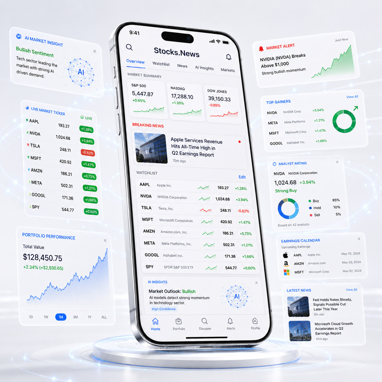
Built a high-traffic real-time stock news aggregation platform processing millions of data points daily. Push notifications, portfolio tracking, and AI-curated market insights for retail investors across iOS and Android.
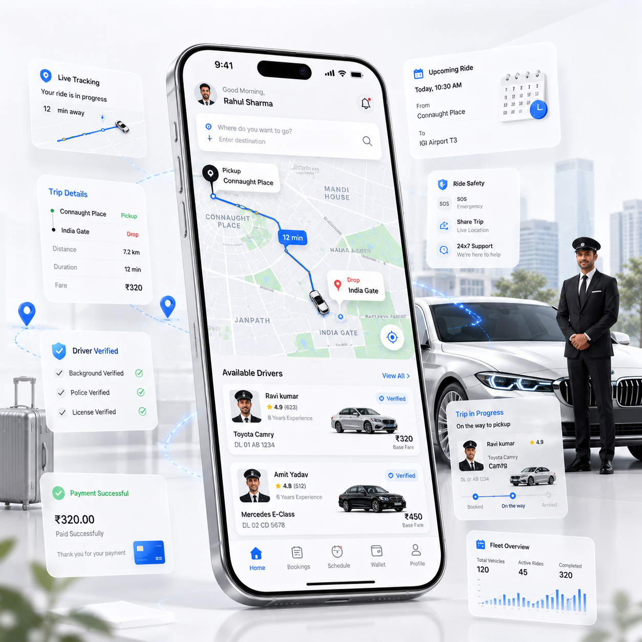
Professional car driving service platform operating across Delhi, Gurugram, Jaipur & Noida. Real-time driver booking, GPS tracking, ride management, and payment integration — letting customers sit back, relax, and enjoy hassle-free rides.
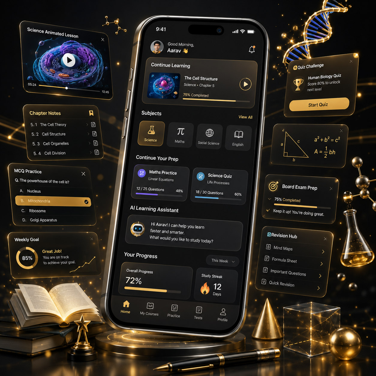
Animated learning app for Class 9th & 10th students featuring 2D/3D video lessons, notes, quizzes, MCQs, and practice questions across Science, Maths, Social Science, Hindi & English — making concepts clear, engaging, and exam-ready.
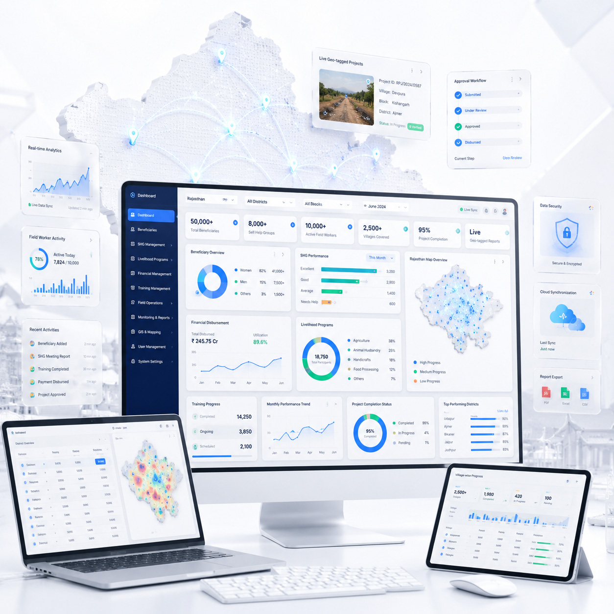
Digital transformation for Rajasthan's rural livelihood program. Custom ERP, beneficiary tracking, geo-tagged reporting, and multi-level admin dashboards used by 10,000+ field workers.
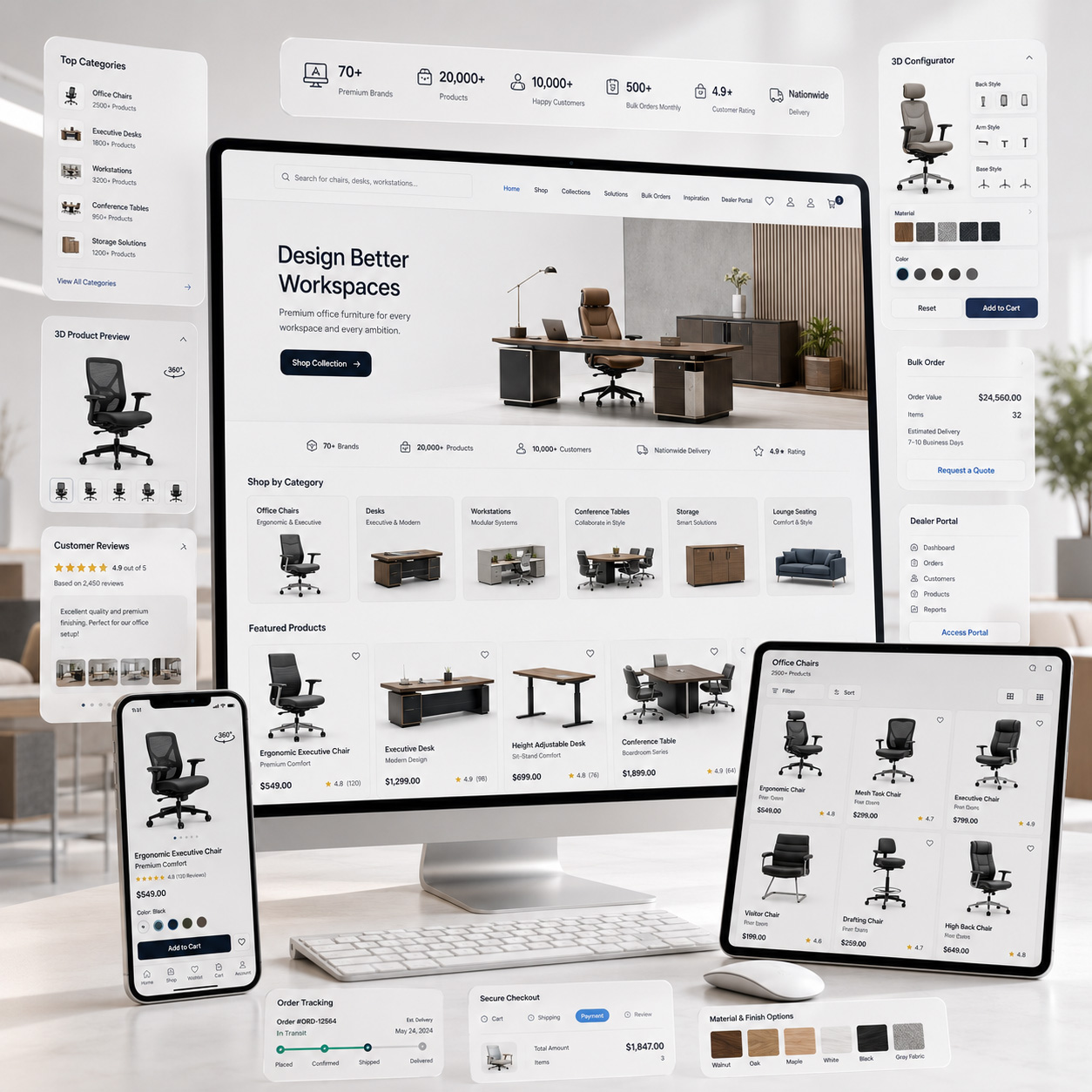
Doctor profile platform with appointment booking, patient management, prescription builder, and teleconsultation integration. Clean UX designed for non-tech-savvy practitioners.
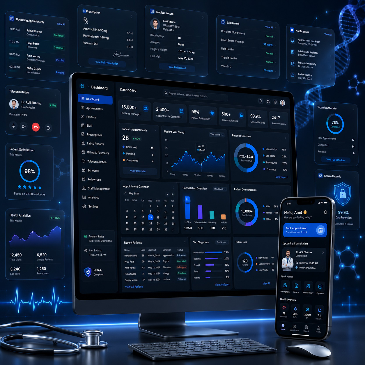
High-traffic global media platform handling millions of monthly readers. Custom CMS, contributor management, SEO optimization engine, and multi-language content delivery at scale.
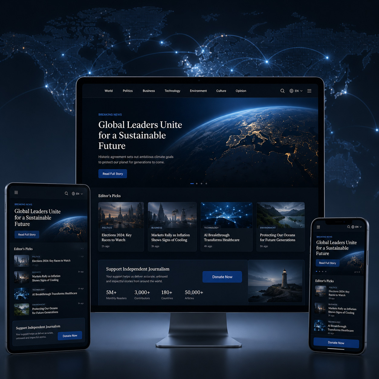
Premium ecommerce platform for office furniture with 3D product visualization, custom configurator, bulk ordering, and dealer management system serving B2B and B2C customers.
We offer web development solutions that meet the unique needs of businesses from various sectors and industries. Since each sector has unique workflows, requirements for data, users, and objectives, we develop solutions tailored to industry-specific requirements.
Create reliable digital platforms for financial businesses such as banking, funds, money transfers, investments, and other financial activities.
Learn more
Build healthcare solutions like patient management, appointment scheduling, telehealth, healthcare activations, and data management solutions for health professionals.
Learn more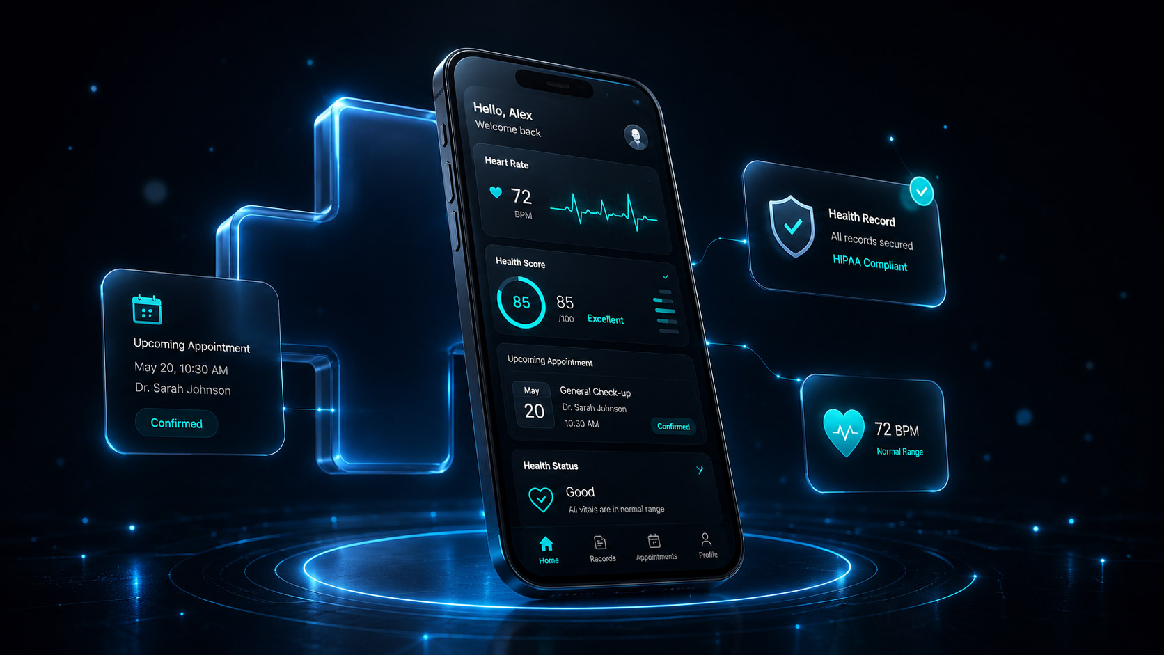
Create educational online sites and platforms for personalized learning, management of students, assessment, and education-related initiatives.
Learn more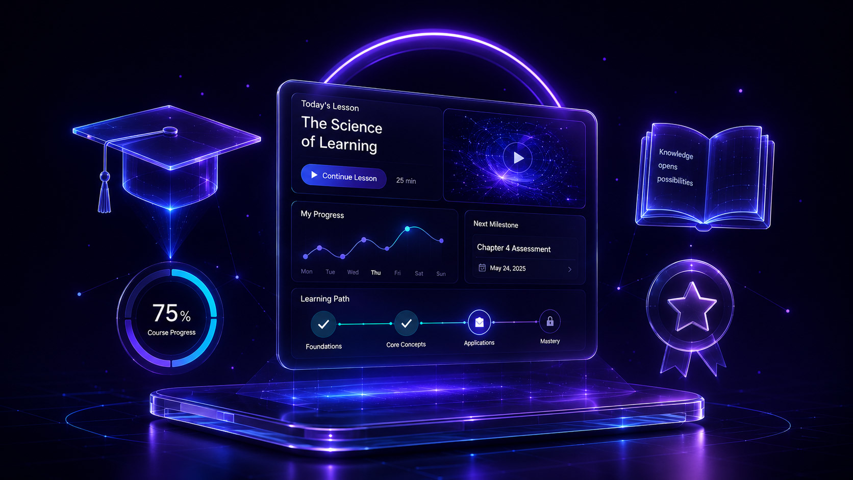
Build mobility solutions for transportation companies, fleet management, driver operations, and associated sectors.
Learn more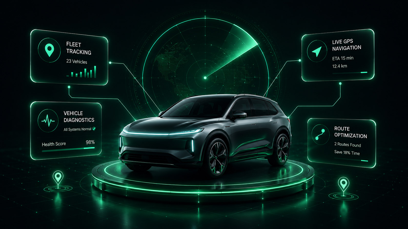
Create user-friendly SaaS solutions for all types of companies featuring workflow management, user management, analytical tools, and lots of other instruments required for business growth.
Learn more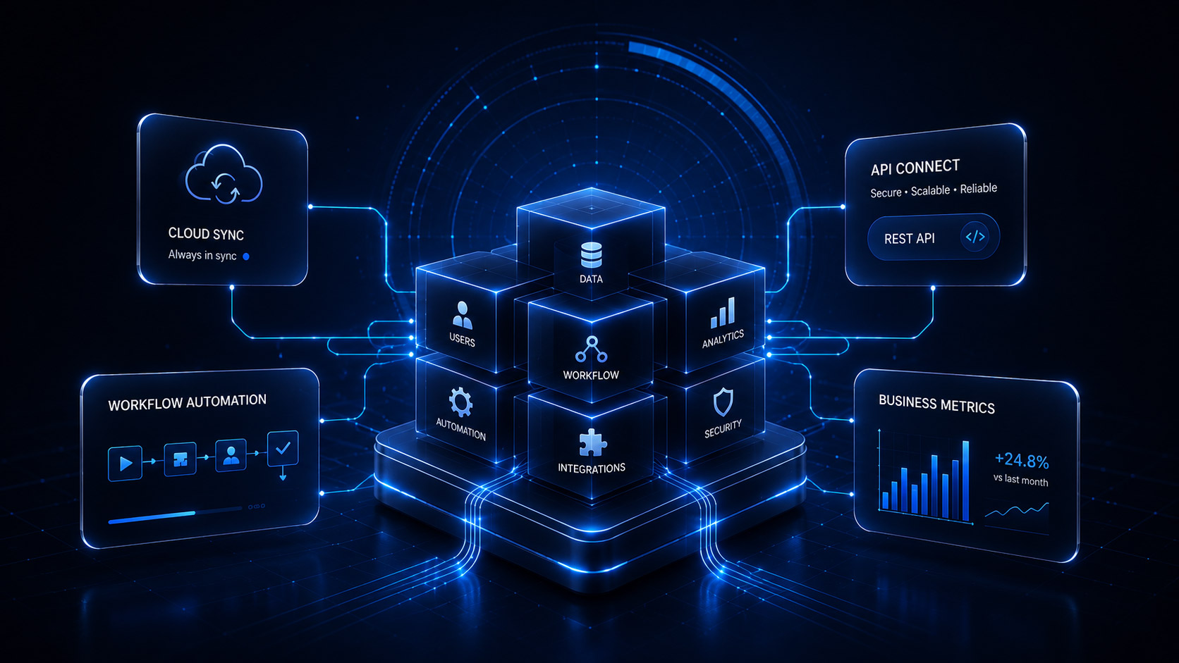
Build user-friendly e-commerce websites and solutions including product management, payment processing, and all activity related to shopping in general.
Learn more
Your mobile-first design sets the foundation for all experiences — we ensure exceptional usability, accessibility, and speed
Large tap targets, swipe gestures, and thumb-friendly navigation zones ensure comfortable one-handed mobile usage
Flexible layouts that adapt seamlessly from 320px mobile screens to 4K desktop displays without breaking or overflow
Readable font sizes, proper line heights, and optimized spacing ensure comfortable reading on small screens without zooming
Core functionality works on basic mobile browsers, with enhanced features progressively added for capable devices
WCAG 2.1 AA standards with proper contrast ratios, screen reader support, and keyboard navigation for inclusive design
Comprehensive testing on actual mobile devices, emulators, and browser dev tools ensures pixel-perfect mobile experiences
Optimized images, minified code, and efficient loading strategies deliver page load times under 3 seconds on mobile networks
Properly configured viewport meta tags and responsive images ensure perfect rendering across all mobile screen sizes
Mobile-friendly design, fast loading, and proper markup ensure strong mobile search rankings and visibility
Compressed images, web fonts optimization, and lazy loading reduce bandwidth usage on mobile data connections
Hardware-accelerated animations and optimized rendering deliver buttery-smooth 60fps scrolling on mobile devices
Unified design language and behavior patterns ensure familiar experiences whether users switch between phone and desktop

Let's discuss how Netleon can support your business growth with scalable, well-engineered solutions.